

Gauges
Gauges are designed to portray key performance indicators (KPIs) in a more graphic manner than in-grid KPIs.
Designed to complement the capabilities of the KPI measures derived from either the data model (or cube) and Custom KPIs, the animated gauges are best viewed in story boards since they can reflect the same formatting and theme choices available to all the other components (unlike standard KPI's which are not) through customizations in the Gauges ribbon tab.
Gauge Features
In addition to the gauge graphic design itself, each gauge is composed on several elements:
- Model based KPIs use 4 elements
- Custom KPIs use 3 elements
These are as follows:
- Value - this is the main numerical value shown in the gauge graphic
- Title - this is the caption of the gauge and header information
- Other Values - usually the secondary numeric values of the gauge
- Target - applicable for model/cube based KPIs only - indicating the target value
These elements are composed into a gauge visual - which are based on 15 gauge design types.
Gauge Visualizations
The graphic representation of a gauge is designed as part of the KPI definition itself. It is not something that can be manipulated as part of the client side formatting.
Both Model based and Custom KPIs use the same gauge visuals - however, Custom KPIs has a longer list of gauge choices. These can be set when designing the custom KPI. Model KPIs are converted (see below).
Gauge visual options are as follows
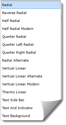
Examples of gauges are available here.
Model Based Gauge Visualizations
If model-based KPIs are used, each original KPI type is auto converted to a gauge graphic as follows:
- Arrow - rendered as an arrow
- Cylinder - rendered as a linear gauge
- Face - rendered as a semi-radial gauge
- Gauge - rendered as a radial gauge
- Reverse Gauge - rendered as a radial gauge with reverse color bars
- Shape - rendered as a horizontal LED bar
- Sign rendered as a quarter-radial gauge
- Thermometer - rendered as a thermometer
- Traffic Light - rendered as a traffic light
Gauge Elements
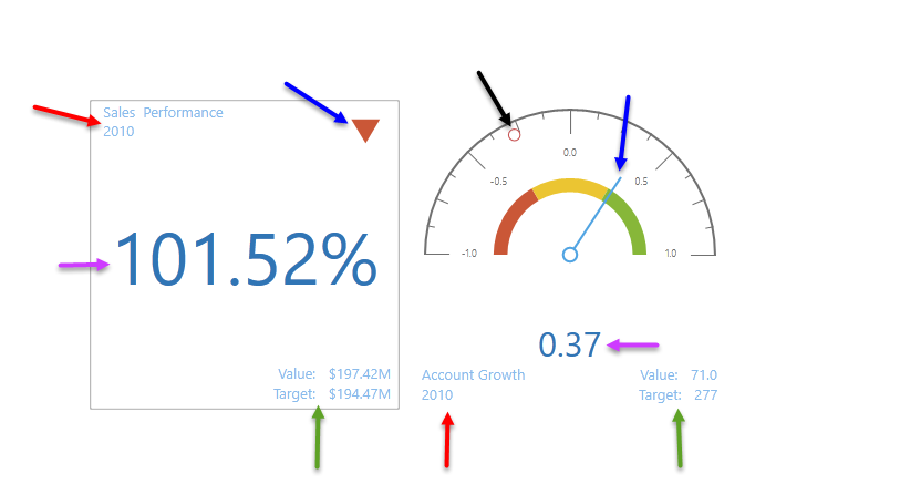
The 5 key elements of gauges are shown in the examples below. The left gauge is a Custom KPI gauge, using the "Text and Indicator" visualization. The right gauge is a model/cube based KPI using the "Half Radial" visualization.
- Purple arrows: main value. By default this is the "status" value. However, this can be change to Actual or Target with client side formatting in the Gauge Tab.
NOTE: The value itself reflects both the value's data format as well as heuristic formatting changes sometimes needed to squeeze large values into the visual space provided. See here for more.
- Red arrows: titles. By default this it the KPI name and any other hierarchical selections driving the KPI. The selection text design can be reformulated an formatted in the Gauge tab.
- Green arrows: other values. These are the other values of the KPI which are actual and goal by default. They are changed to the alternatives if the main value (purple arrow) is changed.
- Blue arrows: status. Depending on the gauge visual type, the status is shown as the gauges "status" value in the context of the banding logic (green/yellow/red etc). In the text gauge below, its shown with a colored icon. On the radial gauge it is shown as the line indicator on the banding spectrum.
- Black arrow: target: Applicable only to model based KPIs, the target value is shown as an alternative marker on the dial.
Reading Microsoft Gauges
Microsoft gauges are all designed to reflect a status value of between "-1" and "1" for cube driven KPIs. Status values are generated by the queries in a cube, and are formulaically set by the cube's administrators.
Typically, these are reflected in the associated theme packages as being a range of 3 colors : red (for -1), green (for 1) and yellow (for 0, or neutral). The dial, counter, direction or light is usually set to reflect one of these three color settings to graphically highlight the underlying status value.
Gauge Layout and Auto-Trellising
Gauges can be laid out manually using the layout button the gauge tab or they can be auto-laid out using the Auto trellising option. This engine optimizes the layout of the gauges based on screen based on the number of charts and the available screen real estate
Gauge Titles and Values
The Gauge Title text is designed to reflect the constituent elements in the query that describe the given gauge. Using the advanced dialog box for titles in the gauge ribbon tab, users can elect to change how the title is constructed or use the default. The key elements are:
- &[KPI] - this is a marker for the KPI's name from the cube
- &[ROWS] - this is a reflection of all the elements from the row coordinates of the underlying query that describe the KPI
- &[COLUMNS] - this is a reflection of all the elements from the column coordinates of the underlying query that describe the KPI
Home |
Table of Contents |
Index |
User Community
Pyramid Analytics © 2011-2022